Why CIOs Are Investing in Offshore Development Centers (ODC) in 2026
ODCs have become one of the major strategies in the quest by various organizations to hasten digital innovation in 2026. Firms are increasingly under pressure to introduce new products in the shortest time and yet cope with the development costs that are on the rise. Concurrently, there is a shortage of competent technology individuals in most local markets.
The ODC for enterprise IT assists organizations in tapping international talent, minimizing the cost of business operations, and creating scalable development teams. Rather than being mere outsourcing firms, the current offshore centres are long-term strategic technology facilitation partners that assist in constant innovation. Read on to explore offshore development center benefits and beyond in 2026.
The Talent Crunch Driving ODC Adoption
Software developers, cloud constructors, and cybersecurity experts are hard to find in technology firms throughout the globe. The demand and supply put a strain on developing senior developers who may take four or six months to hire in most countries. This time lag has the power to slow product development and innovation.
Offshore Development Centers help firms overcome this challenge by providing access to a global talent base of skilled engineers. Other nations, such as India, Poland, and the Philippines, are characterized by dedicated development teams, which enable companies to make efficient teams and speed up technological innovations.
Cost Efficiency Without Sacrificing Quality
The need to save on costs is still among the largest factors why organizations invest in Offshore Development Centers. The cost of development offshore is quite cheap compared to North America or Western Europe. Whereas the domestic developers might be making high hourly charges, the offshore professionals are offering competitive expertise at a less expensive rate. However, contemporary ODC for enterprise ITis not merely affordable.
These facilities are oriented towards the provision of high-quality solutions using sophisticated equipment, uniformity in development practice, and seasoned engineering staff. Cost efficiency and quality technology delivery benefit the companies.
Hybrid Development Models for Better Control
Most companies are taking hybrid development models in work with Offshore Development Centers. In this model, the local teams deal with product strategy, project planning, and even stakeholder communication, whereas offshore teams deal with the engineering process (coding, testing, and deployment).
The structure enables the businesses to have strategic control and enjoy the global development capacity. A lot of companies are now focusing on IT cost optimization without compromising product quality and innovation speed.
In the contemporary world, collaboration tools such as Microsoft Teams, GitHub, and Slack simplify the communication approach of distributed teams as well as handling complex development tasks across geographic locations.
AI and Automation Transforming ODC Operations
Automation and artificial intelligence are contributing significantly to the change of the Offshore Development Centers. The development tools that were based on AI have the ability to automate code testing, detect bugs earlier, and enhance the quality of the software. DevOps pipelines are also automated so that continuous integration and continuous deployment can be done.
These technologies minimize labor and boost productivity among the development teams. Consequently, offshore engineers have the ability to work on more complex issues and innovations rather than on the routine development activities, leading to the enhancement of the overall efficiency of the project.
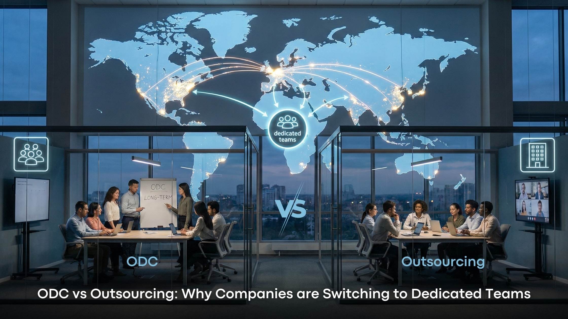
Strategic Partnerships Over Traditional Outsourcing
Over the recent years, the relationship between the companies and the offshore teams has changed a lot. Organizations are no longer keen on short-term outsourcing contracts, but they would rather enter into long-term relationships with offshore development providers.
These alliances are aimed at common objectives, cultural compatibility, and constant cooperation. A lot of companies are exploring a global capability center strategy, where businesses establish their own offshore centers to manage critical development operations.
Other firms go further to open Global In-House Centers (GICs), which are branches that are fully owned offshore and deal with product development and research projects. The strategy assists organizations have a good command of intellectual property while enjoying international talent and resources.
Key Technology Trends Influencing ODC Investments
There are a number of key technology trends that define the future of Offshore Development Centers. Modern software systems are now developed using cloud-native, which provides the ability to scale more quickly and use infrastructure more effectively. DevOps is also on the increase, whereby teams can automate their development pipelines and issue updates on a regular basis.
INC’s artificial intelligence is enhancing productivity by automating repetitive work. Security is also a very important area of focus, and offshore teams adopt the best cybersecurity practices in order to secure the sensitive company information and comply with regulations.
Popular Global Destinations for ODCs
India remains at the top of the favorites list of the offshore development centers as the Asian country with an immense engineering workforce and powerful IT infrastructure. The Eastern European nations like Poland and Ukraine are reputed to be experts in the fields of fintech, security, and sophisticated software engineering.
Another emerging destination is the Philippines, which has high English communication levels and cultural fit with Western businesses. Organizations tend to choose locations depending on such aspects as technical competence, economic considerations, time zone compatibility, and financial reliability.
Managing Challenges in Offshore Collaboration
Even though you explore offshore development center benefits, there are some challenges that organizations also have to solve. There is also a possibility of communication gaps in case teams work in various time zones or in different cultural settings. The companies are also required to defend intellectual property and practices that are strictly observed as far as security is concerned.
Effective organizations get through such challenges through the adoption of effective governance structures, safe working environments through collaboration, and effective service level agreements. The agile development features like daily stand-ups, sprint reviews, joint project management tools, and others assist in keeping transparency and make collaboration run smoothly.
A CIO Playbook for Launching an ODC
The first thing that CIOs aiming at creating an Offshore Development Center must do is define clear business objectives. These goals can be the minimization of the development period, the enhancement of software quality, or the increase of digital capabilities. It is also recommended to start with a pilot project to assess the performance of the team and their efficiency in cooperating.
Firms must also ensure that offshore groups adhere to the same technology standards, security measures, and development framework within the firm. After the model has been successful, organizations will be able to slowly increase the number of offshore teams to assist other projects.
The Bottom Line
These are some of the reasons why CIOs are investing in offshore development centers. If you are looking for reliable software development outsourcing to help you scale innovation, you should make the best use of SiRA Consulting’s expertise. We help businesses create quality software quickly at low cost that helps them ensure their competitiveness in this fast-paced tech world.